Chart-Specific Features |
Marker Information
|
Overview
You can combine several chart types with line or candlestick markers to highlight data trends or show variance. When you add line or candlestick markers onto bar, scatter, or other chart types, the resulting chart is called a compound chart. Some compound charts look like a combination of two chart types—for instance, a bar chart with a tracking line:

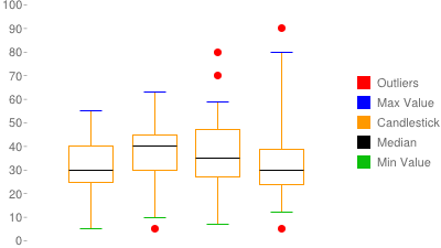
while others look like completely new chart types—for instance, a box chart:
 .
.
Creating a Compound Chart
All compound charts consist of one or more base chart types (line, scatter, bar, or radar) combined with one or more sets of markers. These markers require data to place them on the chart. Sometimes you can use the same data series as used to draw the bars or points on your chart, but typically you want the markers to have their own independent data sets. If you want your chart to have different data series for the base chart and for markers, you must hide the marker data from the base chart (so that it doesn't try to draw more bars or lines with that data). Here's how to do that:
- Add your marker data series to the
end of your
chdparameter. For example, if your bar chart had datachd=t:30,10,20, you could add new data for a line marker like this:chd=t:30,10,20|60,40,50. - Hide your extra marker data from the base chart. If you
simply add an extra data series to a bar chart for your tracking line, the chart
would show that as a new series of bars. To prevent
this, you must hide this extra series. To hide a series, include a single digit
after the
chdformat descriptor: for example,chd=t1:30,10,20|60,40,50. This digit tells the Chart API how many data series to use to draw elements for that base chart type as defined by thechtparameter (bars for bar charts, data points for line charts, and so on). Any additional data series will be ignored by that chart type when drawing the chart. Note that this is a 1-based number, not 0-based. Sot1means "use only the first data series for bars,"t2means "use only the first two series for bars," etc.- Notes:
- Scatter charts - Scatter charts hide data in a different way; see the documentation for more details.
- lxy line charts -
Specify an even number of series to display (
t0,t2,t4, etc). This is because each line in anlxychart is described by two data series: one for x-values, and one for y-values.
- Notes:
- Use the hidden data series to draw candlestick markers, line markers, or other markers. How to draw markers is covered in the linked sections. Reference the hidden data series as the source for your markers. You can include as many additional hidden data series as you like, and use them for additional chart markers.
Here's the chart we just described:
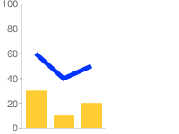
cht=bvg

  chd=t1:30,10,20|60,40,50

      chm=D,0033FF,1,0,5,1
Chart Types
Here is a list of marker types, and the chart types that they can be used with:
| Marker Type | Base Chart Types That Support It |
|---|---|
| Line | Line, Scatter, Bar, Radar |
| Candlestick | Line, Bar |
| All others | Line, Scatter, Bar, Radar |
Here are some examples of the types of compound charts that you can create:
| Chart Type | Description | Example |
|---|---|---|
| Line marker charts | Line markers can be used to show trends in many other chart types. | 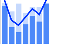 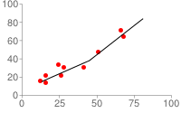 |
| Candlestick charts | Candlestick charts are often used to show financial data. | 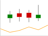 |
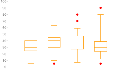
| Box charts | Box charts are used to show data grouped into range quartiles. |
 |
| Embedded charts | You can embed a chart within another chart. | 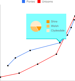 |
| Other markers | You can hide marker data in any of the acceptable base chart types and use it with any other kinds of markers that you like. | 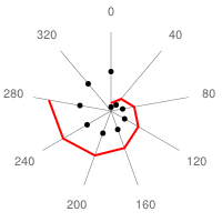 chd=t1: |
Line Marker Charts
You can add lines to line, scatter, bar, or radar charts to highlight trends.
| Base Type + Marker Type | Description | Example |
|---|---|---|
| Bar + Line | Here is a bar chart with a trace line. The first two data
series are used for the stacked bars, and the remaining series is used
for the line.
|
 chm= |
| Scatter + Line | You can add a line to a scatter chart to show averages. Note that scatter charts hide marker data in a different way; see Scatter Charts for more details. | |
| Bar + Line | Here is another stacked bar chart with an independent line drawn over it. |
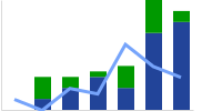 cht=bvs |
| Bar + Circles | Same as the previous chart, but with circle markers instead of a line marker. We've specified every 0.5 data value, which adds calculated intermediary points in the dotted line. | 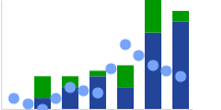 cht=bvs |
Candlestick Charts
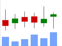
Candlestick charts require at least four data series to draw the candlesticks, plus additional series for any other chart elements. Candlestick charts can show only a set of candlestick markers, or can be a combination of candlestick markers plus bar or line charts, as shown here:
| Base Type + Marker Type | Description | Example |
|---|---|---|
| Line (hidden) + Candlestick | This example shows a chart showing only candlestick markers.
|
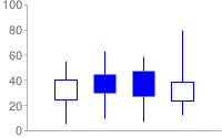 cht=lc |
| Line + Candlestick | Here's an example of a line chart with candlestick markers. Five data series are provided; the first is used for the chart
type (line), and the remaining "hidden" data series are used
for the candlestick markers. The We omitted the first and last candlestick markers using The |
|
| Line + Candlestick | Another example of a candlestick chart, but with custom fill colors. |
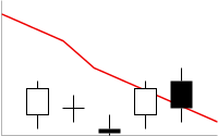 chd=t1: |
| Bar + Candlestick | Here is an example of a bar chart with candlestick markers. We show the first and last candlestick markers here, because the bars add enough spacing to prevent them from being cropped by the chart boundaries. |
 cht=bvg |
Box Charts
Box charts, also called box plots or box and whisker charts, are a type of chart that shows the grouping of one or more series into quartiles (quartiles are groups that span 25% of the range of values, with the possible exception of outliers). Box charts are similar to candlestick charts, but with added markers for the bottom and top of the candlestick, plus a 50th percentile marker.
A box chart is made up completely of markers, as shown here:
 chm= |
 chm= |
 chm= |
 |
One set of candlestick
markers (chm=F), for the body of the boxes: |
One set of adjustable-length horizontal
line shape markers (chm=H) for the minimum, 50th, and 100th
percentile lines: |
Optionally some circle shape
markers (chm=o) to show outliers in the data set. |
Put them all together, and you have a box chart! |
The base chart type for box charts is any of the bar
chart types (bhs, bvs, bhg, bvg)
or line chart types (lc, ls, lxy).
But if you are hiding the base chart type by
adding a zero in the data format parameter (for example: chd=t0: or chd=s0:),
it doesn't matter which chart type you choose.
A box chart must have at least five data series: four for the boxes and the maximum
and minimum markers; one for the 50% marker; plus any additional data series for
any additional markers that you might want, such as outlier markers. Here is the
recommended series order. Note that if the value in series 1 is more than the corresponding
value in series 2, the box will be filled with the chm=F marker color;
if the value in series 1 is less than the value in series 2, the box will be unfilled.
See Candlestick Markers for more information.
Series order for an unfilled box:
- Minimum value
- 25% marker (75% for a filled box)
- 75% marker (25% for a filled box)
- Maximum value
- 50% marker
- Series six and beyond are for any additional marker data, such as outliers.
You can actually put the additional marker series before or after the candlestick marker data, but it is simpler to put them all last.
You can make different styles of box charts by specifying different markers, different base chart types, or ordering the data differently
| Description | Example | ||
|---|---|---|---|
This is a standard box chart, but with different colors assigned to the different chart elements to highlight which marker is being used to create each chart element.
|
|
||
| The lc chart type will always show axis lines. To create a chart without axis lines, specify a chart type of ls. |
|
||
| To create a filled box, make the point in the second series greater than the corresponding point in the third series. The larger value is marked in red in the code shown on the right. | 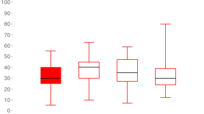 chd=t0: |
Embedded Charts

You can embed any chart type inside a bar, line, radar, or scatter chart
using dynamic icons. See the Embedded
Charts section of the Dynamic Icons (chem) marker documentation.
Standard Features
The rest of the features on this page are standard chart features.

